Visual template builder
Drag-and-drop blocks across 9 categories, a live properties panel, and personalization variables with autocomplete.
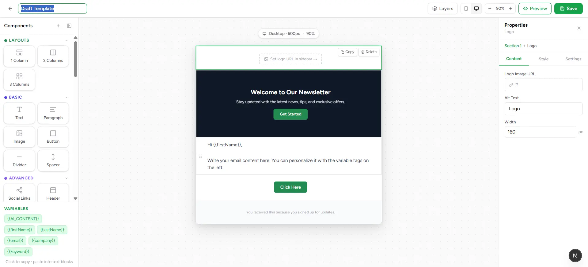
No code, no guesswork — just drag a block onto the canvas, click it, and shape it exactly how you want. The Visual Builder gives you a genuinely deep component library and a real properties panel underneath it, so "no-code" doesn't mean "limited."
Build polished, engaging emails with an intuitive visual editor—no code needed.
How it works
Drag a block onto the canvas
Pick from the components panel on the left, or open the floating, searchable picker for the same list in a compact popup.
Click it to select it
The properties panel on the right switches to that block's settings instantly.
Shape it in Properties
Content, colors, spacing, borders, typography — everything about the selected block lives in one panel, organized into tabs.
Check Layers for the big picture
Open the Layers panel to see and reorder every block in the email as a flat list — handy once a template gets long.
Preview, then save
Preview renders the real email full-size; Save writes it to your library (or straight into your campaign — more on that later).
Nine block categories
The component library isn't just headings and buttons — it's a genuinely deep set, grouped into nine categories:
| Field | What it means |
|---|---|
| Layouts | 1, 2, and 3-column structures to build your email's basic shape. |
| Basic | Text, Paragraph, Image, Button, Divider, Spacer — the everyday building blocks. |
| Advanced | Social Links, Header (logo + nav), Footer, CTA Block, Product Card. |
| More | Logo, Hero Banner, Quote, List, Alert, Card. |
| Media | Video, Gallery, GIF, Banner, Infographic, Background Text. |
| Commerce | Pricing, Coupon, Referral, Countdown, Order Summary, App Download. |
| Engagement | Testimonial, Review, Survey, FAQ, Announcement, Newsletter. |
| Content | Features, Steps, Icon Grid, Table, Checklist, Signature. |
| Layout+ | 4 Columns, Sidebar Left, Full Image, Dark Section, Branded Section, Bordered Box. |
Don't want to build from zero?
The properties panel
Select any block and its properties panel covers real design ground, not just a text field: font family, weight, size, line height, and letter spacing; text color, background color, and gradients; border width, style, color, side, radius, and shadow; padding on all four sides; and — for buttons, images, columns, and socials — their own specific controls (button sizing and shape, image corner rounding and framing, column ratio and gap, icon size and shape). Two-, three-, and four-column blocks also let you drop other blocks directly inside each column, nested as far as you need.
Personalization variables
Click into any text block and type {{ — a filtered autocomplete list pops up right there, arrow keys and Enter to insert. Get it wrong and the block flags an unrecognized variable in red underneath it; get it right and it's confirmed with a green checkmark.
One AI_CONTENT block per template
The rest of the toolbar
Undo & redo
Ctrl+Z and Ctrl+Y (Cmd on Mac) step through your edit history, same as everywhere else in the app.
Desktop / mobile toggle
Switch the canvas width to preview how the email reflows on a phone-sized screen.
Zoom
Five zoom levels from 50% to 125% — zoom out to see the whole email, in to fine-tune a detail.
Layers panel
A draggable, floating list of every block in the email — useful for reordering or finding a block buried in a long design.
Design panel
Global settings that apply to the whole email — page background, content width, default font, link color, corner radius, and the hidden preheader text shown in inbox previews.
Duplicate any block
Hover a block on the canvas and click Duplicate to clone it in place — faster than rebuilding a similar section from scratch.
Components panel
The full block library on the left — search it in the floating picker, or browse it by category.
Canvas
The center workspace where your email actually takes shape, rendered exactly as it will look.
Properties panel
The right-hand panel — whatever's selected on the canvas, its full set of controls lives here.